May, 2016
INTERIOR ARCHITECTURE
Color & Composition
Exploring Color as a Design Tool
This studio investigated the relationship between color, composition, and spatial perception in interior architectural design. Through a sequence of hand-rendered studies, architectural drawings, and material explorations, I developed a deeper understanding of how color influences our experience of space, light, texture, and atmosphere.
Working primarily by hand—with paint, markers, and colored pencils—the course emphasized observation, precision, and the ability to communicate design ideas through traditional architectural representation.
Color Theory
The first study established a visual vocabulary of color through a series of hand-painted exercises exploring the fundamental principles of color interaction.
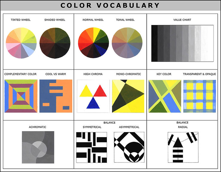
These exercises provided the foundation for understanding how hue, value, saturation, and composition influence visual perception and design decisions.
One-Point Perspective Rendering
The second project introduced architectural rendering through one-point perspective. Using a published interior photograph as a reference, I first produced a precise line drawing that accurately reconstructed the space using perspective principles.

The drawing was then rendered in grayscale to study light, shadow, depth, and volume before being completed in full color using markers and colored pencils to match the original interior.
This exercise strengthened my ability to translate two-dimensional references into architectural drawings while developing techniques for communicating materials, lighting, and spatial depth.
Interior Rendering & Color Schemes
The next assignment focused on how different color strategies transform the perception of the same interior.
A room was drafted using two-point perspective and rendered multiple times, each exploring a different color approach:

Grayscale | Monochromatic | Analogous | Complementary
By applying multiple palettes to the same architectural composition, I examined how color relationships alter mood, emphasis, balance, and the emotional character of an interior without changing its physical form.
Material Palette & Interior Mood Board
The final project integrated color theory with interior material selection.
Starting from a furnished living room floor plan—including seating, tables, rugs, plants, and flooring—I first created a grayscale rendering to study texture, value, and material contrast. The plan was then developed into a full-color presentation using markers and colored pencils.

To complete the design process, I researched and selected physical material samples that reflected the proposed interior palette, including upholstery fabrics, flooring finishes, carpet textures, and complementary surface materials. These samples were assembled into a presentation board that communicated the overall atmosphere, materiality, and visual identity of the space.
This project demonstrated how color decisions extend beyond paint selection to include the interaction of finishes, textiles, lighting, and material textures in creating cohesive interior environments.
Reflection
These studies established a strong foundation in color theory, architectural representation, and material composition—principles that continue to inform my interdisciplinary design practice. Hand rendering and material exploration taught me to think about color not simply as an aesthetic choice, but as a fundamental element of communication, atmosphere, and human experience.